Ice cream packaging does more than hold frozen treats. It’s your brand’s first handshake with customers, happening in those critical seconds when shoppers scan freezer aisles. If your packaging connects, people grab it without thinking twice. If it doesn’t, even amazing ice cream just sits there gathering frost.
This guide covers what actually matters in ice cream packaging design—from materials that survive freezer conditions to visual elements that drive purchases.
Table of Contents
What is Ice Cream Packaging Design?
Ice cream packaging design creates the complete system housing frozen desserts—combining containers, labels, and visual branding that protect product quality while communicating value to buyers.
The challenge? Your packaging lives in one of the harshest retail environments imaginable. We’re talking sub-zero temperatures, constant condensation, frost buildup, and stacking pressure that would crush ordinary containers. And somehow it still needs to look appetizing enough to make people hungry.
Good packaging handles all these competing demands—it’s got to be tough but beautiful, functional but eye-catching, affordable but premium-looking.
Why Your Ice Cream Packaging Actually Matters
It’s Your Silent Salesperson
Nobody’s standing in the freezer aisle pitching your product. Your packaging does that job alone—communicating flavor, quality, and brand personality in seconds.
Product Protection is Non-Negotiable
Poor packaging absolutely destroys good ice cream. Freezer burn, ice crystals, off-flavors, mushy texture—these problems trace straight back to packaging that couldn’t handle the job. Your container needs to protect product integrity from the moment it’s filled until the customer scoops that last bite.
Shelf Appeal Drives Sales
Visual impact matters enormously in impulse-driven categories. Shoppers often wander into the ice cream aisle without a specific brand in mind. Your packaging needs to interrupt their scanning pattern and make them think “yeah, I want that.”
Regulatory Requirements Can’t Be Ignored
Every market has mandatory labeling requirements—ingredients, allergens, nutritional facts, production dates. Smart design incorporates these legal necessities without killing aesthetic appeal.
Essential Elements of Ice Cream Packaging
Material Selection
Your material choice affects everything: printability, durability, sustainability, and cost.
Paperboard containers work beautifully for premium pints. They print gorgeously, feel substantial in hand, and communicate quality. They’re also eco-friendly and recyclable. Downside? They cost more than plastic alternatives.
If you’re serious about sustainability, check out our guide on sustainable packaging ink options to ensure your paperboard choices align with eco-friendly printing practices.
Plastic tubs dominate family-sized segments. They’re durable, cost-effective, and allow transparent windows for product visibility. Many consumers view them as less premium, though perception is shifting with better design.
Molded fiber made from recycled paper offers sustainability credentials with unique texture. It’s gaining traction among eco-conscious brands willing to pay premium prices.
Biodegradable plastics (PLA) made from plant sources promise environmental benefits with plastic-like performance. They work in industrial composting facilities but confuse consumers used to traditional recycling.
For a deeper dive into packaging material choices, our rigid vs. corrugated boxes guide covers structural considerations that also apply to ice cream containers.
Color Strategy
Colors trigger instant emotional responses:
Bright, saturated colors signal fun and indulgence. Think vibrant pinks, electric blues, sunny yellows. These appeal to families and children, suggesting excitement over sophistication.
Pastel tones communicate premium positioning and adult appeal. Soft pinks, muted greens, and gentle blues suggest artisanal quality and refined taste.
Earth tones like browns, tans, and sage greens signal natural ingredients and health-conscious formulations. They work for organic, low-sugar, or “better-for-you” positioning.
Strategic white space implies purity, simplicity, and premium quality. Minimalist designs with ample breathing room stand out against cluttered competitors.
Typography That Works
Font choices speak volumes:
Bold, playful fonts with rounded edges and energetic character appeal to families. They suggest fun, excitement, and childhood joy.
Elegant serif fonts communicate heritage, craftsmanship, and premium quality. They target adult consumers willing to pay more for perceived quality.
Clean sans-serif fonts project modern, health-focused, contemporary sensibilities. They work for brands emphasizing natural ingredients or nutritional benefits.
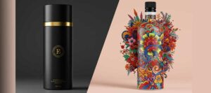
Imagery Approach
You’ve got three main paths:
High-quality photography shows actual ingredients and finished product. It builds trust and creates appetite appeal, especially for premium brands highlighting real strawberries, visible chocolate chunks, or creamy texture.
Illustration offers flexibility and distinctive personality. It works beautifully for family brands, nostalgic positioning, or playful approaches. Illustrated characters can become brand assets lasting decades.
Minimalist graphics let flavor and brand name dominate. Simple geometric shapes, subtle patterns, or single-color backgrounds work for ultra-premium positioning.
Current Packaging Trends Worth Watching
Sustainability Takes Center Stage
Environmental concerns now influence purchase decisions across demographics. Younger buyers especially favor brands with credible sustainability commitments.
Smart brands are switching to recyclable paperboard, reducing plastic usage, using plant-based inks, and clearly communicating recycling instructions. Here’s the thing though—people can smell fake environmental claims from a mile away. If you’re genuinely doing sustainable stuff, great. If you’re just slapping green leaves on plastic, customers will notice and call it out.
Minimalism vs. Maximalism: The Great Debate
Clean, uncluttered designs with generous white space increasingly dominate premium segments. These minimalist designs let product quality speak for itself rather than shouting for attention.
However, maximalist approaches—bold patterns, vibrant colors, busy compositions—work brilliantly for brands targeting younger, adventurous consumers seeking excitement and novelty.
The choice between these approaches depends entirely on your brand positioning and target audience. We explore this design philosophy debate in depth in our article on minimalist vs maximalist packaging design.
Bold Typography Makes Impact
Oversized fonts—sometimes taking up half the package—create instant shelf impact. When done well, bold typography communicates confidence and makes flavor identification effortless from distance.
Nostalgia Sells
Retro designs tapping into childhood memories and simpler times resonate powerfully. Vintage color palettes, old-school typography, and throwback illustrations stand out against sleek modern competitors.
Digital Connections Extend Engagement
QR codes linking to recipes, brand stories, sourcing information, or loyalty programs turn one-time purchases into ongoing relationships. The technology is simple; the engagement potential is significant.
Types of Ice Cream Packaging Formats
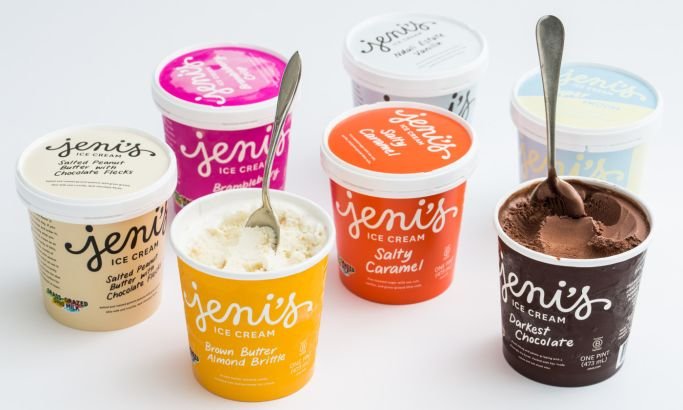
Pint Containers (473ml)
Pints dominate the premium segment. They’re perfect for artisanal brands, limited editions, and adventurous flavors. The smaller format justifies higher per-ounce pricing while the compact size provides excellent branding real estate.
Design advantages: 360-degree branding opportunity, stackable for efficient display, lid provides additional messaging space, substantial enough to feel premium.
Design challenges: Limited surface area demands disciplined editing, must work in both vertical and horizontal orientations, information hierarchy becomes critical.
Quart and Half-Gallon Tubs
Larger formats target families and value-conscious buyers. The big surface area allows for impactful visuals, but these packages need to work harder to avoid looking cheap.
Design advantages: Massive branding canvas, room for multiple flavors in the same line, handle integration adds convenience.
Design challenges: Maintaining premium perception at value price points, structural stability when full, efficient freezer space usage.
Single-Serve and Novelty Packaging
Individual portions—bars, sandwiches, cones—appeal to impulse purchases and portion control. Each unit needs its own branding while fitting into larger variety packs.
Design advantages: Perfect for impulse purchases, portion control appeal, on-the-go convenience.
Design challenges: Tiny branding space, wrapper durability in freezer conditions, moisture resistance, clear flavor identification in multi-packs.
Practical Design Considerations for Frozen Conditions
The Condensation Problem
Temperature changes create condensation that beads up on packaging, obscuring text and images while potentially causing ink to run or labels to peel.
Solutions: Matte finishes resist water beading better than gloss. Waterproof inks prevent bleeding. Moisture-resistant coatings protect printed surfaces. Strategic information placement keeps critical details away from high-condensation areas.
For freezer-safe printing, selecting the right ink is crucial. Sustainable packaging inks now offer both environmental benefits and superior performance in cold, moist conditions.
Cold Temperature Performance
Standard adhesives fail in freezer conditions. Labels applied with wrong adhesives peel off, creating unsellable products.
Solutions: Cold-temperature adhesives maintain bond strength at -20°C and below. Sealed label edges prevent moisture intrusion. Integrated (printed-on) packaging eliminates adhesive concerns entirely.
Print Production Realities
Colors shift under freezer lighting. What looks perfect in natural light appears different under the blue-tinted fluorescent tubes common in freezer cases.
Solutions: Test color accuracy under actual freezer lighting. Account for bleed and safe areas (minimum 3mm bleed, 5mm safe zone for critical text). Use high-resolution files preventing pixelation when printed at production size.
Structural Integrity Testing
Frozen containers face drop impacts, stacking pressure, and freeze-thaw cycles that test structural limits.
Testing checklist: Drop test from shelf height when frozen, stack test with full weight loads, lid seal integrity after temperature cycling, scoopability test after 24-hour freezer storage.
Sustainability in Ice Cream Packaging
Environmental concerns increasingly drive material choices and design decisions.
Eco-Friendly Material Options
FSC-certified paperboard from responsibly managed forests offers recyclability and biodegradability with excellent printability. It costs more but communicates environmental commitment.
Plant-based PLA plastics derived from corn or sugarcane promise renewable sourcing and industrial compostability. Consumer confusion about disposal methods remains a challenge.
Molded pulp from recycled paper creates unique texture while being fully compostable. It’s gaining traction despite higher costs and printing limitations.
Design for Recyclability
Mixed materials complicate recycling. Smart design uses single materials or easily separable components. Water-based inks, minimal coatings, and clear recycling instructions help products actually get recycled rather than landfilled.
Material Reduction Strategies
Optimize structural design for thinner walls maintaining strength. Eliminate unnecessary secondary packaging. Design containers with after-use value encouraging reuse.
Cost Realities of Packaging Design
Material Costs
Container materials typically represent your largest packaging expense. Paperboard costs more than plastic but justifies premium pricing. Buying power matters—larger orders dramatically reduce per-unit costs.
Design Investment
Freelance designers offer budget-friendly options for startups ($1,000-$3,000 range). Design agencies provide comprehensive development including market research and strategy ($5,000-$20,000+). In-house teams carry ongoing salary costs plus software expenses.
Production Minimums
Custom printing typically requires 10,000-50,000 unit minimums. Stock containers with custom labels start around 1,000-5,000 units. Fully custom structures may demand 100,000+ units for cost efficiency.
These minimums significantly impact startup costs and inventory management.
Common Packaging Mistakes to Avoid
Information Overload
Trying to fit everything onto your packaging just creates a mess that nobody can read. Shoppers don’t have time to decode cluttered designs in those quick freezer aisle decisions. Pick your 2-3 most important messages and let the rest go.
Poor Flavor Differentiation
When all your flavors look similar, customers get confused and frustrated. Strong color coding and imagery systems let shoppers find their preferred flavor instantly while maintaining overall brand recognition.
Ignoring Freezer Realities
Designs looking gorgeous on screen often fail in actual freezer conditions. Frost obscures details. Odd viewing angles in vertical cases change perceptions. Condensation damages certain finishes. Always test in real conditions.
Trend Chasing
Following every design trend creates packaging that feels dated within months. Balance timeless brand elements with trend-influenced accents you can refresh without complete redesigns.
Creating Buzz with Your Ice Cream Packaging
If you’re launching a new ice cream brand or refreshing your line, consider how your packaging can generate media attention and social sharing. Premium packaging design creates opportunities for PR coverage and influencer partnerships.
Learn how to leverage your packaging design for maximum media impact in our guide on creating PR packages that get media coverage. While focused on PR boxes, the principles apply to retail packaging that generates buzz.
Packaging Inspiration from Other Categories
Sometimes the best ice cream packaging ideas come from adjacent categories. The beauty and personal care industries excel at creating tactile, premium experiences that drive unboxing moments and social sharing.
For creative inspiration on premium packaging experiences, check out our cosmetic packaging boxes. Many design principles—like creating anticipation, communicating luxury, and optimizing for social media—transfer beautifully to frozen desserts.
Measuring Packaging Success
Sales velocity (units per store per week) before and after redesign tells the real story. Market share changes show competitive positioning impact. Pricing power reveals whether packaging justifies premium positioning.
Consumer research through A/B testing, focus groups, and in-store observations provides qualitative insights numbers don’t capture. Social media monitoring reveals organic consumer reactions and sharing behavior.
Brand recognition, perceived quality, and loyalty metrics show longer-term brand equity building beyond immediate sales impacts.
Conclusion
Ice cream packaging design sits at this interesting intersection where creativity meets engineering, where marketing bumps into food safety regulations, and where beautiful design has to survive brutal conditions. Making it all work takes understanding your customers, knowing where you fit in the market, and being realistic about what frozen distribution does to packaging.
Start with crystal-clear brand positioning. Choose materials matching your sustainability commitments and budget realities—our sustainable packaging ink guide can help you make informed choices. Create visual systems that differentiate flavors while maintaining brand recognition. Test everything in actual freezer conditions before committing to production.
Whether you lean toward minimalist or maximalist design approaches, ensure your choice authentically reflects your brand values and resonates with your target customers.
Remember: your packaging is your silent salesperson working 24/7 in freezer aisles nationwide. Make it count.