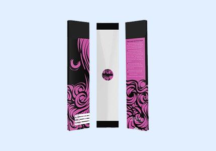
Purple Hair Extension Packaging Boxes
Make your brand unforgettable with purple hair extension packaging boxes from Eco Packaging Box. Our vibrant purple packaging differentiates your products in crowded markets and creates strong visual impact. Available in custom purple shades perfectly matched to your brand identity using Pantone color matching. Choose from soft pastel purples for feminine elegance or rich, deep purples for dramatic luxury. Combine with white, gold, or silver graphics for stunning contrast. Perfect for Instagram-worthy packaging that customers love to share. Our purple boxes feature premium materials, professional construction, and exceptional color consistency across production runs. Create cohesive brand identity with packaging as beautiful as your hair extensions.
Material and Paper Stock Options for Purple Hair Extension Packaging Boxes
SPECIFICATION
| Dimensions | All Custom Sizes & Shapes |
| Printing | CMYK, PMS, No Printing |
| Paper Stock | 10pt to 28pt (60lb to 400lb) Eco-Friendly Kraft, E-flute Corrugated, Bux Board, Cardstock |
| Quantities | 100 – 500,000 |
| Coating | Gloss, Matte, Spot UV |
| Default Process | Die Cutting, Gluing, Scoring, Perforation |
| Options | Custom Window Cut Out, Gold/Silver Foiling, Embossing, Raised Ink, PVC Sheet. |
| Proof | Flat View, 3D Mock-up, Physical Sampling (On request) |
| Turn Around Time | 8-10 Business Days , Rush |
Thickness of Packaging Material
| Thickness of Packaging Material | GSM Weight |
| 13 point Pulp | 200 gsm |
| 14 point Uncoated | 270 gsm |
| 16 point C2S / Solid Bleached Sulfate (SBS)* | 350 gsm |
| 18 point C2S | 400 gsm |
| 24 point Uncoated | 405 gsm |
| 24 point C2S / Solid Bleached Sulfate (SBS)* | 460 gsm |
| 40 point Cotton | 600 gsm |
Paper Stock
Duplex Chipboard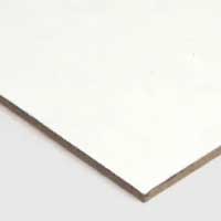 | Grey Chipboard Cardboard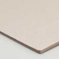 | Textured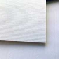 |
Black Kraft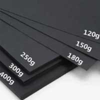 | Holographic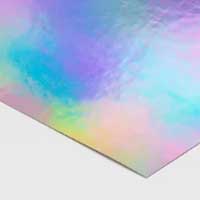 | Natural Brown Kraft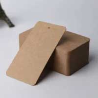 |
Metallic Paper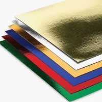 | SBS C2S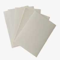 | White Kraft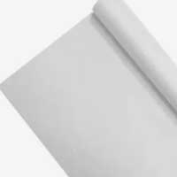 |
Our Finishing Option
Foil Stamping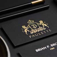 | Gloss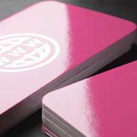 | Spot UV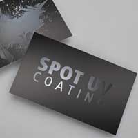 |
Matte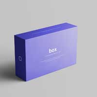 | Holographic Foiling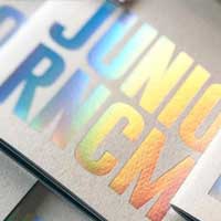 | Embossing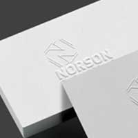 |
Debossing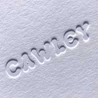 | Soft Touch Lamination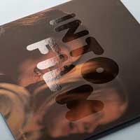 |
Unlock Endless Custom Boxes & Packaging Ideas
Chat live with our packaging pros for a free consultation and get an instant price quote now!
Purple Hair Extension Packaging Boxes
Color isn’t just decoration—it’s communication. And purple? Purple tells a very specific story about your brand, whether you realize it or not. It’s one of the few colors that carries instant luxury associations while also feeling creative, modern, and just a bit rebellious. At Eco Packaging Box, we’ve seen purple packaging transform brands from forgettable to memorable, from “just another hair extension company” to “that gorgeous purple brand everyone’s talking about.”Let’s talk about why purple works and how to use it strategically.
The Cultural Power of Purple in Beauty Markets
Purple has been making people feel things for literally thousands of years. Understanding that emotional and cultural baggage helps you use the color strategically rather than just picking it because you like how it looks.
From Royal Robes to Modern Luxury Perception
Here’s a quick history lesson that actually matters for your business: in ancient times, purple dye came from sea snails and was absurdly expensive to produce. Only royalty and the extremely wealthy could afford purple fabric, which is why it became associated with power, prestige, and exclusivity. That association hasn’t disappeared—it’s just evolved. Modern consumers don’t consciously think “royal purple equals ancient emperors,” but the subconscious connection to luxury remains strong. When someone sees purple packaging, especially deep, rich purples, their brain registers “premium” even if they can’t articulate why. Beauty brands have picked up on this, which is why you’ll see purple in luxury skincare, high-end cosmetics, and premium hair care. Using purple for your hair extension packaging taps into thousands of years of cultural programming about luxury and quality.
The Creative and Spiritual Dimensions of Purple
Purple sits between warm red and cool blue on the color spectrum, giving it unique psychological properties. It’s simultaneously energizing and calming, passionate and thoughtful. That makes it perfect for beauty brands because it suggests transformation—the idea that your hair extensions don’t just change appearance but boost confidence, enhance creativity, express personality. As part of our cosmetic boxes purple collection, we help brands understand which shade of purple communicates what. Lighter purples (lavender, lilac) feel more feminine, romantic, and approachable—great for brands targeting younger audiences or positioning themselves as accessible luxury. Deeper purples (plum, eggplant, royal purple) feel more sophisticated, mature, and exclusive—perfect for premium positioning.
Navigating the Complete Purple Spectrum
Purple isn’t one color—it’s a family of colors, and choosing the right shade is critical for your brand positioning and target market appeal.
Light and Pastel Purples for Soft Femininity
Lavender and lilac create an entirely different vibe than deep purple. These lighter shades feel gentle, romantic, and Instagram-friendly in ways that darker purples don’t. They photograph beautifully in natural light, which matters enormously for social media marketing. Brands using pastel purples often target younger demographics—late teens through twenties—who are drawn to that soft, dreamy aesthetic. These shades work exceptionally well for spring and summer collections, bridal hair extensions, or products marketed for special occasions like proms and graduations. The challenge with light purples is ensuring they don’t read as childish or cheap. Quality matters even more here—a poorly printed lavender can look washed out and unprofessional, while a beautifully executed one with proper saturation feels premium and sophisticated.
Deep and Rich Purples for Premium Positioning
Now we’re talking about the purples that command attention and justify premium pricing. Deep purple, royal purple, plum—these are the shades that work for luxury brands competing at higher price points. They feel expensive, mysterious, and exclusive in ways that lighter purples can’t match. Rich purples pair beautifully with metallic accents; gold foil on deep purple looks absolutely stunning and screams luxury. Silver creates a cooler, more modern feel. Rose gold adds warmth and contemporary elegance. Our hair extension packaging in deep purple shades works particularly well for virgin hair collections, professional salon-quality products, or limited edition launches. These purples also have better shelf presence—they stand out in retail environments dominated by blacks, whites, and pinks without being obnoxiously loud.
Strategic Color Pairing for Maximum Impact
Purple is versatile in terms of color combinations, but not every pairing works equally well. Some combinations enhance purple’s strengths; others undermine them completely.
Metallics That Elevate Purple to Luxury Status
This is where purple packaging goes from nice to unforgettable. Gold and purple create instant opulence—think luxury chocolates, premium skincare, high-end perfumes. It’s a classic combination that’s been used for centuries because it simply works. The warmth of gold complements purple’s cool tones, creating visual balance. Gold foil stamping on purple packaging catches light beautifully and photographs exceptionally well for product marketing. Silver with purple creates a more modern, slightly edgier aesthetic. It feels less traditional than gold, more contemporary and minimalist. This combination appeals to younger luxury consumers who want sophistication without feeling old-fashioned. Rose gold is the trendy middle ground—it has gold’s warmth but with modern appeal that resonates particularly well with millennial and Gen Z consumers. Rose gold on purple packaging is Instagram catnip; it photographs gorgeously and creates that aspirational lifestyle aesthetic.
Neutrals and Contrasts That Make Purple Pop
White graphics on purple create crisp, clean contrast that’s both readable and visually striking. It’s practical for essential information while maintaining elegance. White text on deep purple backgrounds has excellent legibility, which matters for retail packaging where customers need to quickly find product information. Black accents with purple add drama and contemporary edge. This combination feels more urban, more fashion-forward. It works beautifully for brands targeting city markets or positioning themselves as trendy rather than traditional luxury. Cream or off-white tones soften purple and create vintage-inspired aesthetics that work well for brands emphasizing natural, organic, or artisanal qualities.
Technical Mastery of Purple Production
Here’s something most people don’t realize: purple is one of the trickier colors to reproduce consistently in printing. Getting it right requires technical expertise and quality control.
Achieving Consistent Purple Across Production Runs
Purple falls into that challenging zone of the color spectrum where slight variations become very noticeable. A purple that skews too red looks entirely different from one that leans blue, even if the actual difference is minimal. This is why Pantone matching becomes absolutely critical for purple packaging. We don’t just approximate your purple; we match it precisely using Pantone’s standardized color system and verify it with spectrophotometers that measure color scientifically rather than relying on human eyes. This ensures your purple looks identical whether you’re ordering your first batch of 500 boxes or your tenth batch of 5,000. Consistency is crucial for brand recognition—customers need to spot your signature purple from across a store or immediately recognize it when scrolling through social media.
Finish Selection That Transforms Purple’s Character
The finish you choose dramatically affects how purple appears and feels. Matte finishes create sophisticated, velvety purple that feels modern and upscale. Colors appear slightly deeper and richer with matte coating. It photographs beautifully without glare, which makes it perfect for social media content and product photography. Matte purple has that high-end cosmetics feel that customers associate with premium products. Glossy finishes make purple more vibrant and saturated. Colors pop with intensity that attracts attention on retail shelves. Glossy coating creates shine that catches light, making packaging more dynamic and eye-catching from different angles. It’s a more traditional packaging approach but works wonderfully for certain brand aesthetics. Soft-touch coating on purple packaging creates a luxurious tactile experience that elevates perceived value. That smooth, almost rubbery texture combined with rich purple color signals premium quality immediately. Spot UV on matte purple backgrounds—maybe glossy purple patterns on a matte purple base—creates dimensional visual interest that’s sophisticated and memorable.
Purple as Strategic Market Differentiation
In markets saturated with predictable packaging colors, purple creates instant differentiation that translates into shelf presence and brand recall.
Standing Out in Crowded Beauty Markets
Walk into any beauty supply store or scroll through hair extension listings online. What do you see? Lots of black packaging. Tons of pink. Some white, some gold. Purple? Much less common, which makes it strategically valuable. When everything around your product is black or pink, purple stands out without trying too hard. It’s distinctive without being weird, memorable without being loud. That visual differentiation translates into increased browse-stopping power—customers literally pause when they see something unexpected. In e-commerce, where you’ve got maybe half a second to catch someone’s attention as they scroll, distinctive purple packaging creates that scroll-stopping moment that makes the difference between being ignored and being clicked.
Building Brand Recognition Through Color Ownership
Some brands become so associated with their signature color that the color itself becomes brand shorthand. Think Tiffany blue, Cadbury purple, UPS brown. While you might not reach that level of color ownership, using purple consistently across all your packaging creates strong brand recognition within your market niche. Customers start associating that specific shade of purple with your brand. They can spot your products from a distance. They remember you more easily than competitors using generic colors. Over time, that purple becomes a brand asset—free advertising every time someone sees that color and thinks of your extensions.
Similar Products: See our Custom Printed Hair Extension Boxes for full-color purple printing with unlimited design possibilities and perfect color matching, Luxury Hair Extension Boxes for premium purple packaging featuring rich materials and sophisticated finishes, and Custom Hair Extension Boxes for personalized purple designs tailored precisely to your brand vision and market positioning.
Related Products
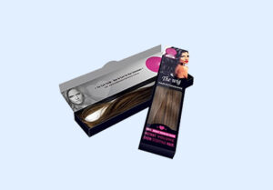
Custom Hair Extension Boxes
Learn more....
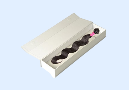
Luxury Hair Extension Boxes
Learn more....
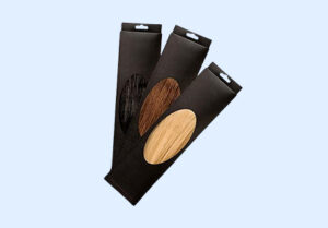
Hair Extension Boxes Wholesale
Learn more....
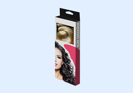
Custom Printed Hair Extension Boxes
Learn more....

Hair Extension Packaging Boxes
Learn more....
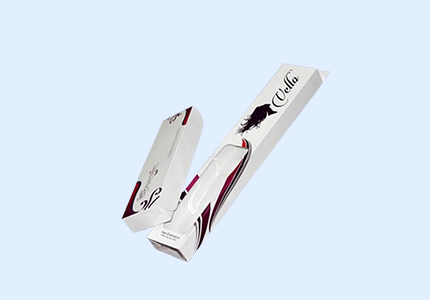
Custom Cardboard Extension Boxes
Learn more....
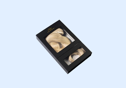
Window Hair Extension Boxes
Learn more....
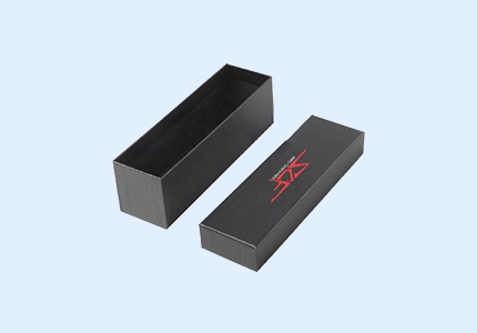
Custom Matte Black Hair Extension boxes
Learn more....


